Against the Corona Panic, Pt. VI: Where has the regular flu gone? The CDC reports unprecedented crash in non-COVID flu-positives, raising questions
This is a guest column by Maxwell that appeared in Hail To You...
Against the Corona Panic, Pt. VI: Where has the regular flu gone? The CDC reports unprecedented crash in non-COVID flu-positives, raising questions
The following mainly consists of a guest post, based on the research of, and written by, Maxwell. It is being published here as an important contribution to the discussion. Thank you, Maxwell.
The question is: What is going on with the US Center for Disease Control (CDC)’s report that influenza-positives (“regular flu”) fell to near zero for late March and April 2020? Usually at 8-15% for Weeks 13 to 16, why were they down to 2% by late March (Week 13), and to 0.8% [!] by April (Weeks 15-16), even as COVID19 cases rise?
Maxwell looks at the CDC data back twenty years. There are several possibilities that suggest themselves for the unusual fall-off; one is that many of those with ‘regular’ flu symptoms are being grouped under the “COVID” umbrella. There may be another explanation, but it’s worth asking.
I first offer a summary of the point with three graphs. Then Maxwell takes over and reports his findings, and asks the relevant questions.
____________
Graphing the Missing Influenza Cases for late March and April 2020
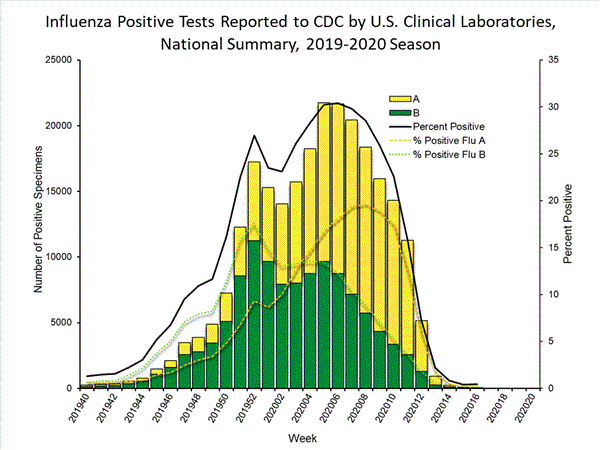
Here is the CDC graph tracking influenza-positives up to Week 16 2020, followed by a second graph, the same tracking-data for the completed 2018-19 season. Note the much sharper drop-off in 2020:

The 2018-19 graph shows the completed seasonal-influenza ‘arc’ for the year (source). Note its familiar bell shape, except for a distortion with a small peak event in Dec. 2018.
Next compare a second graph of the same tracking-data, covering the Corona-Panic period (source: The current Weekly Influenza Surveillance Report). The Panic and increase in tests can be dated to start about Week 12 [March 15 to 21] and still ongoing as April comes to an end here in Week 18 (not graphed yet):

Do you see the difference in shapes there? The right side of what was forming into a nice, symmetrical bell curve as of mid-March then drops off suddenly.
A third graph may help understand this point:

Thus we have the case of the missing influenzas.
Anyone who works with data knows such a sudden jolt like this is an alarm bell, that something extraordinary must explain it, and that it is worth an investigation. In the real world this often means there is some problem with the data-gathering. Otherwise there must some causal factor, because nature(‘s data) always hugs its bell curves.
Look especially at the Influenza-A curve in the 2019-20 graph: It peaked in Week 7-8. Given that its gradual rise began about 2019 Week 45 which is about fifteen weeks before the peak, we would expect the down-slope to look similar, fading to low levels near zero no earlier than 2020 Week 20, and completing our familiar bell shape again. (Have you ever seen a noticeably non-symmetrical bell?)
This means we have, effectively, lots and lots of “missing” influenza-positives to explain, the area of the graph under where the bell-curve should complete itself.
And now, Maxwell takes it away and asks three important concluding questions:
____________
Where has the Regular Flu Gone?
By Maxwell
Even as an unprecedented health event has taken over our lives and taken hold of the early days of 2020 another quiet but related health event has unfolded over at the CDC. While the world has been tracking every twist and turn of the killer COVID virus another familiar virus has been disappeared not only from the CDC’s conversation but also from it’s meticulous monitoring system. Seems our long-standing old friend “the flu” has altogether left the stage over at the CDC and in a fashion that might raise a few eyebrows for those who pay attention to such things.
The following report and tables below are posted not to draw any conclusions but to offer further information and point to some recent irregularities from the CDC that, given the current circumstances, might raise some more questions.
The 8 tables charted below represent Weeks 5-14 from the CDC’s Flu Surveillance Report covering the last 8 years, 2013-2020. Weeks 5-14 were chosen and charted so as to best parallel the current time frame of the COVID 2020 crisis- with the intent of compiling the most up to date information from the CDC. Two more weeks for 2020 have been added to the CDC Surveillance Reports [showing 0.2% flu positives for both weeks 15 and 16], subsequent to my compiling these tables, though in a much less detailed report as the CDC has shifted it’s long-standing focus from detailed reports on the Flu to more detailed information on COVID.
Table 1: 2013 CDC Weekly Flu Surveillance Report
| WEEK/DATE | POSITIVES/TESTS | FLU POSITIVE % | |
| 5- 2/2 | 2,362/10,132 | 23.3% | |
| 6- 2/9 | 1,499/7,608 | 19.7% | |
| 7- 2/16 | 1,371/8144 | 16.8% | |
| 8- 2/23 | 1,288/7,609 | 16.9% | |
| 9- 3/2 | 1,074/6,259 | 17.2% | |
| 10-3/9 | 821/5,747 | 14.3% | |
| 11-3/16 | 899/5,526 | 16.3% | |
| 12-3/23 | 702/5,332 | 13.2% | |
| 13-3/30 | 555/4,909 | 11.3% | |
| 14-4/6 | 484/4,462 | 10.9% |
The CDC introduced its Weekly Flu Surveillance Reports 20 years ago during 1999/2000 season. As one pores over those original reports you see in those early years reports which had a scant amount of detailed information compared to what was to come. For whatever the reasons this all changed significantly in the 2007/2008 season.
In the 07/08 season the CDC reports doubled in length and offered up significantly more detail in their national flu surveillance data. What was once a mom and pop operation turned into a big box store with weekly reports that were once three pages long now expanding into ten page reports complete with colorful graphs and regional information.
With this expanded focus on flu data came much more specificity in each report. The tables that we see above and below are one aspect of those reports which can be viewed here: https://www.cdc.gov/flu/weekly/pastreports.htm. This level of detail and in-depth coverage of the flu was to remain a cornerstone of the CDC’s overall mission and reportage until, well, last week [ca. April 20, 2020].
Table 2: 2014 CDC Weekly Flu Surveillance Report
Table 2: 2014 CDC Weekly Flu Surveillance Report
| WEEK/DATE | POSITIVES/TESTS | FLU POSITIVE % | |
| 5-2/1 | 1,626/8,282 | 19.6% | |
| 6-2/8 | 1,268/7,562 | 16.8% | |
| 7-2/15 | 958/6,887 | 13.9% | |
| 8-2/22 | 738/6,813 | 10.8% | |
| 9-3/1 | 587/6,748 | 8.7% | |
| 10-3/8 | 535/6,372 | 8.4% | |
| 11-3/15 | 495/5,650 | 8.8% | |
| 12-3/22 | 571/4,977 | 11.5% | |
| 13-3/29 | 652/5,206 | 12.5% | |
| 14-4/5 | 685/5,127 | 13.4% |
The first column on the left, as seen above in Tables 1 and 2 represent the specific Week being cited and the date upon which that week started. The middle column represents the number of individual tests taken on the right, and the number of those tests which produced a ‘positive’ result listed on the left.
The column on the far right represents the percentage of ‘flu positives’ during that week. So for example, in Table 2, year 2014, Week 14 which started April 5th we see that there were 5,127 tests taken and 685 of them turning up a ‘positive’ result for a 13.4 overall percentage. This final number, the overall flu positive percentage is the the most significant aspect of this simple survey.
Table 3: 2015 CDC Weekly Flu Surveillance Report
| WEEK/DATE | POSITIVES/TESTS | FLU POSITIVE % | |
| 5-2/7 | 3,174/21,340 | 14.9% | |
| 6-2/14 | 2,381/18,370 | 13.0% | |
| 7-2/21 | 2,236/18,505 | 12.1% | |
| 8-2/28 | 1,834/16,821 | 10.9% | |
| 9-3/7 | 1,670/14,634 | 11.4% | |
| 10-3/14 | 1,685/15,033 | 11.2% | |
| 11-3/21 | 1,358/12,824 | 10.6% | |
| 12-3/28 | 1,300/12,014 | 10.8% | |
| 13-4/4 | 1,138/10,684 | 10.7% | |
| 14-4/11 | 1,076/11,189 | 9.6% |
Table 4: 2016 CDC Weekly Flu Surveillance Report
| WEEK/DATE | POSITIVES/TESTS | FLU POSITIVE % | |
| 5-2/6 | 1,563/17,175 | 9.1% | |
| 6-2/13 | 2,135/17,797 | 12.0% | |
| 7-2/20 | 2,599/18,844 | 13.8% | |
| 8-2/27 | 3,803/21,615 | 17.6% | |
| 9-3/5 | 4,918/23,910 | 20.6% | |
| 10-3/12 | 5,968/25,855 | 23.1% | |
| 11-3/19 | 4,816/23,946 | 20.1% | |
| 12-3/26 | 4,022/21,959 | 18.3% | |
| 13-4/2 | 3,383/20,921 | 16.2% | |
| 14-4/9 | 2,544/18,188 | 14.0% |
A quick look at Tables 3 and 4 together give us another indication as to how, though there are some changes here and there, the flu numbers given to us by the CDC week in and week out to this point represent some rather consistent trends. Historically the ‘flu positive’ numbers are at their highest right around Feb/March and then gradually taper off as “flu season” dissipates and Spring settles in.
In Table 4 from 2016 we saw the flu season come on a little stronger in March and then begin its gradual taper. One can note that in these two tables drop offs of more than 2% from one week to the next are exceedingly rare and drop offs of over 3% virtually non-existent. In short, spikes and/or drop offs of any scale simply do not happen precipitously if these reports are accurate. A quick glance back to Tables 1 and 2 show that this is also the case in those two years and as we will see moving forward is is also case in all of the following years- except one.
Table 5: 2017 CDC Weekly Flu Surveillance Report
| WEEK/DATE | POSITIVES/TESTS | FLU POSITIVE % | |
| 5-2/4 | 5,722/27,409 | 20.9% | |
| 6-2/11 | 8,498/35,098 | 24.2% | |
| 7-2/18 | 8,272/34,517 | 24.0% | |
| 8-2/25 | 8,515/35,124 | 24.2% | |
| 9-3/4 | 5,245/28,166 | 18.6% | |
| 10-3/11 | 4,967/27,105 | 18.3% | |
| 11-3/18 | 4,416/24,680 | 17.9% | |
| 12-3/25 | 4,768/23,666 | 20.1% | |
| 13-4/1 | 4,086/22,257 | 18.4% | |
| 14-4/8 | 3,044/20,079 | 15.2% |
Table 6: 2018 CDC Weekly Flu Surveillance Report
| WEEK/DATE | POSITIVES/TESTS | FLU POSITIVE % | |
| 5-2/3 | 16,641/63,180 | 26.3% | |
| 6-2/10 | 17,040/64,312 | 26.5% | |
| 7-2/17 | 13,730/54,063 | 25.4% | |
| 8-2/24 | 9,191/42,615 | 21.6% | |
| 9-3/3 | 6,193/34,974 | 17.7% | |
| 10-3/10 | 4,223/28,157 | 15.0% | |
| 11-3/17 | 4,326/28,213 | 15.3% | |
| 12-3/24 | 3,575/24,329 | 14.7% | |
| 13-3/31 | 3,357/21,823 | 15.4% | |
| 14-4/7 | 2,490/19,512 | 12.8% |
Tables 5 and 6 (years 2017 and 2018) represent a bit of an overall change in the CDC flu surveillance numbers with a trend towards more tests given and a trend towards overall higher ‘flu positive’ percentages.
One can see a marked increase in tests given. The previous record number of tests in this time frame (the time frame in the CDC conducts it’s most tests year in and year out) was from Week 10 in 2016 when 25,855 tests were given. In just 20 weeks of data from 2017 and 2018 combined that record was broken 13 different times. And the overall percentages of flu positives during this time also went up on average- at around 3.5% per week.
Put simply this seemed to indicate that more people were getting tested and more people were getting the flu. The Why as to the increase in flu tests and ‘flu positives’ is certainly an important question for consideration but is not the purpose of this survey. Even with those increases the overall trend remained the same- the highest rates of ‘flu positives’ in Feb/March, usually early March and a gradual taper leading into April.
Whilst the numbers bounce around a little bit from week to week you can see they don’t bounce too far from one another.
Table 7: 2019 CDC Weekly Flu Surveillance Report
| WEEK/DATE | POSITIVES/TESTS | FLU POSITIVE % | |
| 5-2/2 | 7,205/33,362 | 21.6% | |
| 6-2/9 | 9,428/38,350 | 24.6% | |
| 7-2/16 | 10,210/38,208 | 26.7% | |
| 8-2/23 | 10,316/39,107 | 26.4% | |
| 9-3/2 | 9,434/36,193 | 26.1% | |
| 10-3/9 | 10,591/41,054 | 25.8% | |
| 11-3/16 | 9,046/34,780 | 26.0% | |
| 12-3/23 | 6,876/31,045 | 22.1% | |
| 13-3/30 | 5,324/29,407 | 18.1% | |
| 14-4/6 | 3,957/26,127 | 15.1% |
Table 7 from last year represents more of what we noted in Tables 5 and 6.
As in 2018 the testing numbers remained high – every single one of Weeks 5-14 of the 2018 CDC Flu Surveillance Report exceeded that old figure of 25,855 from 2016. And equally of note 5 out of those 10 weeks in 2019 cited ‘flu positive’ numbers of 20% or more. A look back at our tables shows that the overall composite of ‘flu positives’ in 2019 was an all-time record – an overall increase of 3% weekly over 2017’s previous record. And if we go back to our earlier tables 2019 represented a remarkable overall increase in flu positives of 8% each week compared to 2013 and 11% when compared to the weekly average in 2015.
Yet again while the overall percentages of ‘flu positives’ continued to rise the overall trend remained the same- numbers bouncing around only slightly from week to week and tapering gradually as we headed into April. All of that was about to change.
Table 8: 2020 CDC Weekly Flu Surveillance Report
| WEEK/DATE | POSITIVES/TESTS | FLU POSITIVE % | |
| 5-2/1 | 15,875/53,247 | 29.8% | |
| 6-2/8 | 16,934/54,982 | 30.8% | |
| 7-2/15 | 14,657/49,510 | 29.6% | |
| 8-2/22 | 11,249/42,587 | 26.4% | |
| 9-2/29 | 10,829/44,491 | 24.3% | |
| 10-3/7 | 9,413/43,868 | 21.5% | |
| 11-3/14 | 6,927/45,167 | 15.3% | |
| 12-3/21 | 3,581/51,570 | 6.9% | |
| 13-3/28 | 633/30,656 | 2.1% | |
| 14-4/4 | 180/22,324 | 0.8% |
Before looking at Table 8 from this year we need to remind ourselves that according to the CDC 2020 opened up as a rough flu season. What we will see from these figures in Table 8 is that suddenly and dramatically that has been reversed and coincides with the arrival of Covid 19.
As noted in Table 8 in Week 5 the number of test numbers were quite robust. In only one other season, 2018, had there been so many tests done during Weeks 5, 6 and 7 – no other season was anywhere close to these numbers. And in these three early weeks of 2020 the CDC ‘flu positives’ recorded represented the three highest rates of ‘flu positives’ ever recorded in the CDC’s 20 year history. After looking over 20 years of CDC flu data while it seemed impossible to ignore Weeks 5, 6 and 7 what came next seemed even more incredulous.
As the story of COVID 19 unfolds and demands every ounce of our attention another unique health event, anomalous and perhaps connected goes ignored. An event unprecedented in at least the last 20 years since these things have been detailed by the CDC, coinciding with the C19 event, the CDC quietly informed any who were paying attention that the common flu- both scourge and money-maker – has been disappeared from the United States.
As the trend towards the usual gradual tapering began all of a sudden by Week 12 (March 21st) the ‘flu positive’ numbers dropped off a cliff. When one looks at the numbers from Week 10, 21.5%, to Week 12, 6.9%, we see an incredible drop off of 14.6% occurred. By Week 14 the ‘flu positives’ dropped to nearly non-existent – 0.8%. A quick glance to Week 9, 24.3%, and then down to Week 14’s all time record low of 0.8% shows a drop off of 23.5%.
It’s important to note that while the 22,324 tests done in Week 14 represent a significant drop in tests done compared to earlier weeks in 2020 those numbers still represented the 2nd highest overall Week 14 test numbers done in the history of the CDC. Yet only 0.8% ‘flu positives’ this season when the average for the preceding 7 years was 12.5% for Week 14. Even given the circumstances this is a statistical anomaly that begs many questions. To consider just a few:
Questions that demand answers
- How did such a terrible flu season suddenly disappear?
- In what column have those ‘flu positives’ been placed?
- What happened to all the other seasonal virii that afflict humans this time of the year? Where did they all go?
After a 20 year run the CDC has stated that Flu View, it’s flagship offering, will no longer be offering such meticulous reports as they shift their focus to Covid. It would seem that the CDC has decided after all these years the flu has finally run its course.


Comments
Post a Comment